Summarizing complex landscapes
In the previous section, we illustrate of how to infer a complete combinatorial landscape from empirical data using either VCregression or SeqDEFT. In this section, we illustrate how to obtain low-dimensional summary statistics of the inferred landscapes that characterize the complexity and patterns of genetic interactions across the different sequence positions. We do so by computing the variance explained by genetic interactions of different orders, involving each possible site and
pairs of sites.
GB1 protein landscape
In this section, we first show how we can use gpmap-tools to understand the complexity and patterns of genetic interactions across multiple sites in a previously inferred genotype-phenotype map (GB1) using VCregression and previously published high throughput experimental data.
[46]:
# Import required libraries
import numpy as np
import pandas as pd
import matplotlib.pyplot as plt

from gpmap.datasets import DataSet
from gpmap.summary import GPmapSummarizer
We use the inferred complete combinatorial landscape as provided in DataSets
[8]:
gb1 = DataSet('gb1')
gb1.landscape
[8]:
| y | |
|---|---|
| seq | |
| AAAA | 0.296301 |
| AAAC | -2.713474 |
| AAAD | -2.912992 |
| AAAE | -4.548719 |
| AAAF | -3.276738 |
| ... | ... |
| YYYS | -4.662925 |
| YYYT | -3.223102 |
| YYYV | -3.001718 |
| YYYW | -4.723318 |
| YYYY | -4.876429 |
160000 rows × 1 columns
Firts, we define a GPmapSummarizer object with the configuration of sequence space and the associated functional values for every possible sequence f.
Note: Function values must be provided for sequences in alphabetical order.
[9]:
gb1s = GPmapSummarizer(n_alleles=20, seq_length=4, f=gb1.landscape['y'].values)
How to compute the variance components of interactions of order k
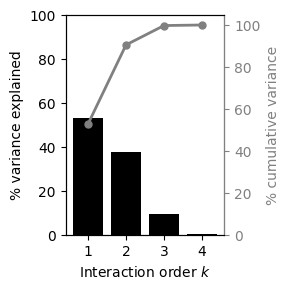
Now, we only need to call the method calc_V_k_variance_components to obtain a pd.DataFrame with the total and percentage variance explained by interactions of every possible order
[10]:
v_k_vcs = gb1s.calc_V_k_variance_components()
v_k_vcs
[10]:
| k | variance | variance_perc | variance_perc_cum | |
|---|---|---|---|---|
| 0 | 1 | 180067.068327 | 52.811580 | 52.811580 |
| 1 | 2 | 128538.741722 | 37.698921 | 90.510501 |
| 2 | 3 | 31449.759748 | 9.223849 | 99.734350 |
| 3 | 4 | 905.762731 | 0.265650 | 100.000000 |
which can be easily represented graphically as follows
[18]:
fig, axes = plt.subplots(1, 1, figsize=(3, 3))

# Plot percentage variance explained
axes.bar(x=v_k_vcs["k"], height=v_k_vcs["variance_perc"], color="black")
axes.set(
    xlabel="Interaction order $k$",
    ylabel="% variance explained",
    xticks=np.arange(1, 10),
    ylim=(0, 100),
)

# Plot cumulative percentage variance explained
axes = axes.twinx()
axes.scatter(v_k_vcs["k"], v_k_vcs["variance_perc_cum"], color="grey", s=25)
axes.plot(v_k_vcs["k"], v_k_vcs["variance_perc_cum"], color="grey", lw=2)
axes.tick_params(axis="y", colors="grey")
axes.spines["right"].set_color("grey")
axes.set(ylim=(0, 105))
axes.set_ylabel("% cumulative variance", color="grey")
fig.tight_layout()
However, this only provides information about the complexity of the landscape, but not about which sites are involved in more or less complex genetic interactions and whether interactions are widespread or happening between specific sets of sites.
How to compute the variance components of interactions involving a subsets of sites \(U\)
This can be done by calling the method calc_V_U_variance_components to obtain a pd.DataFrame with the total and percentage variance explained involving every possible combination of sites
[19]:
v_U_vcs = gb1s.calc_V_U_variance_components()
v_U_vcs
[19]:
| U | k | variance | variance_perc | variance_perc_cum | |
|---|---|---|---|---|---|
| 0 | {0} | 1 | 28303.313131 | 8.301033 | 8.301033 |
| 1 | {1} | 1 | 16149.051370 | 4.736329 | 13.037362 |
| 2 | {2} | 1 | 77458.399775 | 22.717649 | 35.755012 |
| 3 | {3} | 1 | 58156.304052 | 17.056569 | 52.811580 |
| 4 | {0, 1} | 2 | 5138.287598 | 1.507000 | 54.318581 |
| 5 | {0, 2} | 2 | 25776.797274 | 7.560035 | 61.878616 |
| 6 | {0, 3} | 2 | 17682.891637 | 5.186187 | 67.064803 |
| 7 | {1, 2} | 2 | 8761.142103 | 2.569541 | 69.634344 |
| 8 | {1, 3} | 2 | 5422.459340 | 1.590344 | 71.224688 |
| 9 | {2, 3} | 2 | 65757.163770 | 19.285813 | 90.510501 |
| 10 | {0, 1, 2} | 3 | 3723.022582 | 1.091919 | 91.602420 |
| 11 | {0, 1, 3} | 3 | 2675.360421 | 0.784652 | 92.387072 |
| 12 | {0, 2, 3} | 3 | 18786.824440 | 5.509957 | 97.897030 |
| 13 | {1, 2, 3} | 3 | 6264.552305 | 1.837320 | 99.734350 |
| 14 | {0, 1, 2, 3} | 4 | 905.762731 | 0.265650 | 100.000000 |
Whereas the number of possible combinations is relatively small in this case, it scales exponentially with sequence length, making it in practical in other cases to interpret the values in this DataFrame directly. Still, we can compute some useful aggregated statistics that we can represent easily as heatmaps.
How to compute the variance explained by interactions of order k involving each site
calc_sites_variance_perc enables aggregation of these variances by whether they involve each possible site and the total number of sites involved in those genetic interactions.
[21]:
sites = gb1s.calc_sites_variance_perc(v_U_vcs).T
sites
[21]:
| 1 | 2 | 3 | 4 | |
|---|---|---|---|---|
| 0 | 8.301033 | 14.253222 | 7.386529 | 0.26565 |
| 1 | 4.736329 | 5.666886 | 3.713892 | 0.26565 |
| 2 | 22.717649 | 29.415389 | 8.439197 | 0.26565 |
| 3 | 17.056569 | 26.062344 | 8.131930 | 0.26565 |
[44]:
fig, axes = plt.subplots(1, 1, figsize=(3, 3))
im = axes.imshow(
    sites.T.iloc[::-1, :],
    cmap="Greys",
    vmin=0,
)
axes.set(
    xticks=[0, 1, 2, 3],
    xticklabels=[39, 40, 41, 54],
    xlabel="Site",
    yticks=[0, 1, 2, 3],
    yticklabels=[1, 2, 3, 4][::-1],
    ylabel="Interaction order $k$",
    aspect='equal'
)
plt.colorbar(im, shrink=0.6, label='% variance explained')
fig.tight_layout()
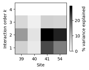
This clearly shows that some sites (41 and 54) have a much larger contribution to the phenotypic variance than others (40), and that they contribute mostly through their additive, pairwise and even threeway interactions.
How to compute the variance explained by interactions between every pair of sites
Another interesting way to aggregate the variance explain by every subset of sites \(U\) is by computing the variance explain by interactions of any order involving a pair of sites.
[45]:
pairs = gb1s.calc_site_pairs_variance_perc(v_U_vcs)
pairs
[45]:
| site1 | site2 | variance | variance_perc | |
|---|---|---|---|---|
| 0 | 0 | 1 | 12442.433333 | 7.733298 |
| 1 | 0 | 2 | 49192.407027 | 30.574370 |
| 2 | 0 | 3 | 40050.839230 | 24.892646 |
| 3 | 1 | 2 | 19654.479720 | 12.215774 |
| 4 | 1 | 3 | 15268.134797 | 9.489546 |
| 5 | 2 | 3 | 91714.303247 | 57.002842 |
We can arrange these values on a matrix and represent them in a heatmap
[54]:
m = pd.pivot_table(
    pairs, index="site1", columns="site2", values="variance_perc"
)
m
[54]:
| site2 | 1 | 2 | 3 |
|---|---|---|---|
| site1 | |||
| 0 | 7.733298 | 30.574370 | 24.892646 |
| 1 | NaN | 12.215774 | 9.489546 |
| 2 | NaN | NaN | 57.002842 |
[57]:
fig, axes = plt.subplots(1, 1, figsize=(3, 3))
im = axes.imshow(
    m,
    cmap="Greys",
    vmin=0,
)
axes.set(
    xticks=[0, 1, 2],
    xlabel="Site 1",
    yticks=[0, 1, 2],
    xticklabels=[40, 41, 54],
    yticklabels=[39, 40, 41],
    ylabel="Site 2",
    aspect="equal",
)
plt.colorbar(im, shrink=0.6, label="% variance explained")
fig.tight_layout()
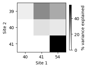
This plot clearly shows that sites 41 and 54 interact strongly with each other, but also with position 39.
Shine-Dalgarno fitness landscape
In the previous example, the total number of subsets of sites \(U\) is still relatively small given the short sequence length. To better illustrate the usefulness of this approach, we will use a 9-nucleotide long complete combinatorial landscape inferred with VCregression from previously published high throughput experimental data in the dmsC gene context. The inferred landscape is also available as a DataSet for illustration
purposes.
[58]:
sd = DataSet('dmsc')
sd.landscape
[58]:
| f | |
|---|---|
| AAAAAAAAA | 0.563857 |
| AAAAAAAAC | 0.701511 |
| AAAAAAAAG | 0.619188 |
| AAAAAAAAU | 0.628772 |
| AAAAAAACA | 0.594683 |
| ... | ... |
| UUUUUUUGU | 0.615910 |
| UUUUUUUUA | 0.539058 |
| UUUUUUUUC | 0.548782 |
| UUUUUUUUG | 0.536610 |
| UUUUUUUUU | 0.564960 |
262144 rows × 1 columns
Lets start again by defining the GPmapSummarizer object and compute the variance explained by every possible subset of sites
[59]:
sds = GPmapSummarizer(n_alleles=4, seq_length=9, f=sd.landscape["f"].values)
[60]:
v_U_vcs = sds.calc_V_U_variance_components()
v_U_vcs
[60]:
| U | k | variance | variance_perc | variance_perc_cum | |
|---|---|---|---|---|---|
| 0 | {0} | 1 | 1574.656812 | 5.500762 | 5.500762 |
| 1 | {1} | 1 | 2687.622462 | 9.388695 | 14.889458 |
| 2 | {2} | 1 | 2312.377111 | 8.077847 | 22.967305 |
| 3 | {3} | 1 | 1806.662119 | 6.311229 | 29.278533 |
| 4 | {4} | 1 | 1051.784760 | 3.674209 | 32.952742 |
| ... | ... | ... | ... | ... | ... |
| 506 | {0, 1, 2, 4, 5, 6, 7, 8} | 8 | 2.485503 | 0.008683 | 99.956748 |
| 507 | {0, 1, 3, 4, 5, 6, 7, 8} | 8 | 2.545558 | 0.008892 | 99.965641 |
| 508 | {0, 2, 3, 4, 5, 6, 7, 8} | 8 | 2.358090 | 0.008238 | 99.973878 |
| 509 | {1, 2, 3, 4, 5, 6, 7, 8} | 8 | 2.796804 | 0.009770 | 99.983648 |
| 510 | {0, 1, 2, 3, 4, 5, 6, 7, 8} | 9 | 4.680847 | 0.016352 | 100.000000 |
511 rows × 5 columns
We can see that the number of components now is much larger than before, so we really need to aggregate these components in a meaningful way to obtain low-dimensional summary statistics reflecting the patterns of genetic interactions in the inferred genotype-phenotype map.
How to compute the variance explained by interactions of order k involving each site
[61]:
sites = sds.calc_sites_variance_perc(v_U_vcs)
sites
[61]:
| 0 | 1 | 2 | 3 | 4 | 5 | 6 | 7 | 8 | |
|---|---|---|---|---|---|---|---|---|---|
| 1 | 5.500762 | 9.388695 | 8.077847 | 6.311229 | 3.674209 | 2.277808 | 1.837005 | 0.835968 | 0.399951 |
| 2 | 6.390370 | 10.088863 | 10.262287 | 8.163453 | 6.898441 | 4.512101 | 3.034212 | 1.908863 | 1.153861 |
| 3 | 5.799007 | 8.710946 | 10.348244 | 11.095941 | 10.542178 | 8.887247 | 5.887798 | 3.522035 | 2.133580 |
| 4 | 2.999159 | 4.047676 | 4.776184 | 5.714224 | 5.930684 | 5.423643 | 4.125461 | 2.856694 | 1.932568 |
| 5 | 1.208228 | 1.508030 | 1.640607 | 1.763638 | 1.809694 | 1.735487 | 1.502939 | 1.196867 | 0.925827 |
| 6 | 0.441740 | 0.488117 | 0.516701 | 0.522051 | 0.525214 | 0.525015 | 0.496194 | 0.446754 | 0.389411 |
| 7 | 0.187551 | 0.194456 | 0.197175 | 0.198214 | 0.199869 | 0.199935 | 0.199599 | 0.192142 | 0.179375 |
| 8 | 0.070391 | 0.071923 | 0.071268 | 0.071478 | 0.071555 | 0.071555 | 0.071691 | 0.071658 | 0.069766 |
| 9 | 0.016352 | 0.016352 | 0.016352 | 0.016352 | 0.016352 | 0.016352 | 0.016352 | 0.016352 | 0.016352 |
[65]:
orders = np.arange(1, 10)
positions = np.arange(-13, -4)
ticks = np.arange(9)

fig, axes = plt.subplots(1, 1, figsize=(4, 4))
im = axes.imshow(
    sites.iloc[::-1, :],
    cmap="Greys",
    vmin=0,
)
axes.set(
    xticks=ticks,
    xticklabels=positions,
    xlabel="Site",
    yticks=ticks,
    yticklabels=orders[::-1],
    ylabel="Interaction order $k$",
    aspect="equal",
)
plt.colorbar(im, shrink=0.6, label="% variance explained")
fig.tight_layout()
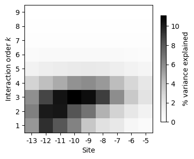
This plot shows that whereas some positions have large additive and pairwise contributions, other sites have more context-dependent contributions to phenotypic variation, with the largest contributions arising from interactions of order 3 or higher.
How to compute the variance explained by pairwise and higher order interactions between every pair of sites
In this example, we do an finer aggregation and separate the variance explained by pairwise and higher order interactions between pairs of sites on the upper and lower triangular parts of the heatmap representation.
[88]:
pairs_pw = sds.calc_site_pairs_variance_perc(v_U_vcs.loc[v_U_vcs['k'] == 2, :])
pairs_ho = sds.calc_site_pairs_variance_perc(v_U_vcs, min_k=3)

m_bottom = pairs_pw.pivot(index="site1", columns="site2", values="variance_perc")
m_bottom = m_bottom.reindex(ticks).T.reindex(ticks).fillna(0)
m_top = pairs_ho.pivot(index='site1', columns='site2', values='variance_perc')
m_top = m_top.reindex(ticks).T.reindex(ticks).fillna(0).T
m = m_top + m_bottom
m
[88]:
| site2 | 0 | 1 | 2 | 3 | 4 | 5 | 6 | 7 | 8 |
|---|---|---|---|---|---|---|---|---|---|
| site1 | |||||||||
| 0 | 0.000000 | 20.235400 | 19.297067 | 12.736994 | 8.528527 | 7.706634 | 5.887429 | 4.593244 | 3.814681 |
| 1 | 8.562998 | 0.000000 | 28.937652 | 22.225871 | 13.779223 | 9.638418 | 7.624355 | 5.565630 | 4.245642 |
| 2 | 9.734242 | 13.710318 | 0.000000 | 28.779777 | 20.837386 | 13.780875 | 7.749691 | 5.786126 | 4.398405 |
| 3 | 1.380292 | 9.409153 | 6.562947 | 0.000000 | 31.867450 | 23.175051 | 12.769771 | 6.189255 | 5.449330 |
| 4 | 1.371878 | 2.865711 | 4.951972 | 7.331872 | 0.000000 | 31.061032 | 19.615363 | 10.645316 | 6.161446 |
| 5 | 1.202204 | 1.320697 | 2.437803 | 3.856483 | 4.213326 | 0.000000 | 21.838515 | 13.053678 | 7.791366 |
| 6 | 1.367760 | 1.333584 | 0.959993 | 1.554637 | 3.281415 | 1.401816 | 0.000000 | 13.716746 | 7.937204 |
| 7 | 0.635882 | 0.887281 | 0.527592 | 0.344046 | 1.860773 | 1.435976 | 1.094349 | 0.000000 | 9.259406 |
| 8 | 0.129675 | 0.408224 | 0.274862 | 0.711385 | 0.446727 | 1.349362 | 0.584660 | 0.498108 | 0.000000 |
[89]:
fig, axes = plt.subplots(1, 1, figsize=(4, 4))
im = axes.imshow(
    m,
    cmap="Greys",
    vmin=0,
)
axes.set(
    xticks=ticks,
    xlabel="Site 1",
    yticks=ticks,
    xticklabels=positions,
    yticklabels=positions,
    ylabel="Site 2",
    aspect="equal",
)
plt.colorbar(im, shrink=0.6, label="% variance explained")
fig.tight_layout()
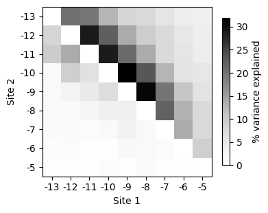
Overall, this summary plots show that positions in the Shine-Dalgarno sequence tend to interact mostly with adjacent positions. Moreover, higher order interactions can involve sites that are further appart from each other in the primary sequence.