Getting Started
The typical use case of gpmap-tools is the analysis of complete combinatorial genotype-phenotype maps, where the goal is to estimate the vector f encoding the phenotype for every possible genotype of a certain length. gpmap-tools leverages Gaussian process models to compute the posterior distribution over all possible f, enabling rigorous uncertainty quantification of phenotypic predictions and mutational effects across different genetic backgrounds. Additionally, gpmap-tools
implements methods for visualizing high-dimensional genotype-phenotype maps to understand their main qualitative features.
Data
gpmap-tools can utilize two types of data for the inference of complete genotype-phenotype maps:
Multiplex Assays of Variant Effects (MAVE) data: Experimental measurements of the phenotype
yfor a subsetXof all possible sequences, possibly with known variancey_var.Observations of natural sequences: A collection of biological sequences
Xof a certain length, e.g., 5’ splice site sequences in the human genome, where the probability of each possible sequence is considered the phenotype.
[1]:
# Import required libraries
import pandas as pd
import matplotlib.pyplot as plt
import gpmap.plot.mpl as mplot

from gpmap.space import SequenceSpace
from gpmap.randwalk import WMWalk
from gpmap.datasets import DataSet
from gpmap.inference import VCregression
Here, we will use experimental data from GB1 protein binding to its target, provided as a DataSet in gpmap-tools, to illustrate the inference and visualization of genotype-phenotype maps.
[2]:
data = DataSet('gb1').data
X, y, y_var = data.index.values, data.y.values, data.y_var.values
data
[2]:
| y | y_var | |
|---|---|---|
| sequence | ||
| AAAA | 0.460831 | 0.046009 |
| AAAG | -2.192261 | 0.255906 |
| AAAH | -4.728306 | 2.064530 |
| AAAI | -4.338842 | 2.095252 |
| AAAL | -2.326240 | 0.087518 |
| ... | ... | ... |
| YYYS | -5.269987 | 0.291090 |
| YYYT | -3.821426 | 0.074489 |
| YYYV | -3.143536 | 0.074682 |
| YYYW | -4.306581 | 0.699467 |
| YYYY | -4.429813 | 0.417405 |
149361 rows × 2 columns
Inference of genotype-phenotype maps
gpmap-tools provides a series of models to infer genotype-phenotype maps from different types of data in the gpmap.inference module. Here, we will use VCregression.
[3]:
model = VCregression(seq_length=4, alphabet_type='protein')
We first infer the model hyperparamenters, in this case the variance explained by interactions of every possible order, as follows:
[4]:
model.fit(X, y, y_var)
Once the hyperparameters defining the prior distribution are inferred, we can compute the posterior mean for the complete genotype-phenotype map f
[5]:
result = model.predict()
result
[5]:
| f | |
|---|---|
| AAAA | 0.117892 |
| AAAC | -3.018971 |
| AAAD | -3.230436 |
| AAAE | -4.805853 |
| AAAF | -3.357901 |
| ... | ... |
| YYYS | -4.927780 |
| YYYT | -3.674239 |
| YYYV | -3.152652 |
| YYYW | -4.663254 |
| YYYY | -5.032998 |
160000 rows × 1 columns
Statistical analysis of genotype-phenotype maps
We can also evaluate the posterior mean and variance for a subset of sequences of interest, whether measured or not, and have an estimation of the uncertainty of the predictions for that particular sequence.
[6]:
model.predict(X_pred=['VWGA'], calc_variance=True)
100%|██████████| 1/1 [00:04<00:00, 4.69s/it]
[6]:
| f | f_var | f_std | ci_95_lower | ci_95_upper | |
|---|---|---|---|---|---|
| VWGA | 0.450483 | 0.001898 | 0.043569 | 0.363345 | 0.537621 |
Likewise, we can compute the posterior for specific sequence features such as mutational effects in specific genetic backgrounds by defining a contrast_matrix specifying the contrasts between sets of genotypes e.g. the effect of a G3A mutation in the VWGA sequence.
[7]:
contrast_matrix = pd.DataFrame({"G3A": {"VWGA": -1, "VWAA": 1}})
contrast_matrix
[7]:
| G3A | |
|---|---|
| VWAA | 1 |
| VWGA | -1 |
[8]:
model.make_contrasts(contrast_matrix)
100%|██████████| 2/2 [00:44<00:00, 22.44s/it]
[8]:
| estimate | std | ci_95_lower | ci_95_upper | p(|x|>0) | |
|---|---|---|---|---|---|
| G3A | 1.110173 | 0.059788 | 0.990597 | 1.22975 | 1.0 |
Visualizing the inferred genotype-phenotype map
Once we have an estimate of the genotype-phenotype map f given by the posterior mean, we can generate a low dimensional representation to understand what are their main qualitative features.
We first compute the coordinates of the low-dimensional representation stored as a pd.DataFrame, so it can be easily stored and read from a file
[9]:
space = SequenceSpace(X=result.index.values, y=result.f.values)
rw = WMWalk(space)
rw.calc_visualization(mean_function=0)
nodes_df, edges_df = rw.nodes_df, rw.space.get_edges_df()
nodes_df
[9]:
| 1 | 2 | 3 | 4 | 5 | 6 | 7 | 8 | 9 | 10 | function | stationary_freq | |
|---|---|---|---|---|---|---|---|---|---|---|---|---|
| AAAA | -0.265346 | -1.142056 | -0.028284 | -0.146887 | -0.590068 | 0.286066 | -0.110796 | -0.179020 | -0.469251 | -0.022557 | 0.117892 | 9.610648e-05 |
| AAAC | 0.021210 | -0.317150 | 0.007629 | -0.127876 | -0.455667 | 0.212128 | 0.002862 | 0.170135 | 0.640595 | -0.054920 | -3.018971 | 3.809275e-06 |
| AAAD | -0.039432 | -0.210704 | 0.051189 | -0.128539 | -0.229740 | 0.226953 | 0.026423 | 0.280779 | 0.507739 | 0.376972 | -3.230436 | 3.064331e-06 |
| AAAE | -0.019125 | -0.216818 | 0.125636 | -0.137143 | -0.241918 | 0.212173 | 0.013606 | 0.198738 | 0.377012 | 0.275633 | -4.805853 | 6.057012e-07 |
| AAAF | 0.135107 | -0.234207 | 0.025914 | -0.177627 | -0.313035 | 0.211957 | 0.004641 | 0.142758 | 0.313033 | 0.191767 | -3.357901 | 2.687632e-06 |
| ... | ... | ... | ... | ... | ... | ... | ... | ... | ... | ... | ... | ... |
| YYYS | 0.085554 | -0.009269 | 0.019560 | -0.079093 | -0.130788 | 0.108081 | 0.006011 | 0.108595 | 0.328963 | 0.176611 | -4.927780 | 5.342784e-07 |
| YYYT | -0.096581 | 0.157110 | 0.011680 | 0.291572 | -0.160266 | 0.092541 | -0.055400 | 0.088160 | 0.218631 | 0.651619 | -3.674239 | 1.940857e-06 |
| YYYV | 0.000852 | 0.158549 | 0.017363 | 0.111156 | 0.151607 | 0.264393 | -0.193680 | 0.156199 | 0.236435 | -0.015429 | -3.152652 | 3.319698e-06 |
| YYYW | 0.163296 | 0.092562 | 0.035020 | -0.059211 | 0.024689 | 0.068828 | 0.025022 | 0.136109 | 0.240455 | 0.208723 | -4.663254 | 7.014363e-07 |
| YYYY | 0.093710 | 0.085482 | 0.038196 | -0.045770 | 0.040822 | 0.141983 | 0.112243 | 0.140656 | 0.255174 | 0.215945 | -5.032998 | 4.794509e-07 |
160000 rows × 12 columns
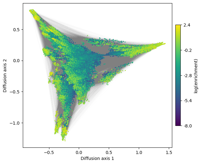
Using the generated DataFrame, we can now visualize the inferred genotype-phenotype map and explore its structure
[10]:
fig, axes = plt.subplots(1, 1, figsize=(7, 6))
mplot.plot_visualization(axes,
                         nodes_df,
                         edges_df=edges_df,
                         nodes_size=5,
                         nodes_cmap_label='log(enrichment)',
                         edges_alpha=0.005)
See the specific sections of the documentation for more details and examples of how to explore these interesting high dimensional objects