Natural sequences
Introduction to SeqDEFT
Many times, rather than quantitative measurements of a phenotype or trait for a large collection of sequences, we just have observations of natural sequences, e.g. 5’ splice sites in the human transcriptome or combinations of chromosomal abnormalities in tumors (See Chen et al. 2022 for more details). In this case, we are interested in estimating the true underlying probability of each of the possible sequences using only a finite number of observations. This number of observations, that typically ranges from few hundreds to tens or hundreds of thousands, is so that the observed frequencies are very poor estimators of the true underlying probability distribution. This is exemplified by the fact that a substantial fraction of all possible sequences are not even present in the finite sample even if they occure with a non-zero true probability
Maximum entropy sequence probability distributions
A simple model would assume that positions are independent from each other, and thus, we can recapitulate the full sequence probability distribution from the site-wise allele probabilities. This is because if two positions are independent, then the probability of observing a particular combination at 2 sites is equal to the product of the individual probabilities at each site or, equivalently, the log-probability of the combination is the sum of the log-probabilities of the alleles at each position.
Thus, we can represent the probability of distribution of sequences of certain length using a field \(\Phi\) as follows and show that the field is just a shifted version of the negative \(\log Q\):
Thus, independent sites models can be generally represented by additive models on the log-transformed probabilities. These models can be generalized by adding pairwise interaction terms like in the Potts model, which have been very succesful for contact prediction and identifying coevolving residues within or between different proteins (See Stein et al. 2015 for an example). They could in principle be further extended in the same way to include higher order components up to \(P\)’th.
All these models belong to the class of maximum entropy models, this is, models that maximize the entropy of the underlying distribution given some constraints. These constraints typically consist on matching the lower order marginals of the data i.e. allele frequencies in the site independens model; frequencies of subsequences at pairs of sites across the whole sequence. While maximizing the entropy provides the simplest possible model that has the desired properties, by doing so it also neglect the existance of interactions beyond the \(P\)’th order.
Relaxing maximum entropy assumption: the \(\Delta^{(P)}\) prior
SeqDEFT relaxes the maximum entropy assumption by instead minimizing the magnitude of the deviations in the field \(\Phi\) from the additive, pairwise, or in general, \(P-1\) order model across all \(P\)-faces of the Hamming hypercube. The strength of this penalization is given by the hyperparameter \(a\). This is equivalent to imposing a normal prior on the the local \(P\)-epistatic coefficients \(\epsilon_P\)’s while conditioning on them being compatible with each other. In particular, for \(P=2\), we minimize the local deviations from a simple additive model or local pairwise epistatic coefficients \(\epsilon_{2}\) without forcing them to be 0 as assumed by Maximum Entropy models.
In this case, we are setting a normal prior on the local pairwise epistatic coefficients, where the variance is inversely related to the hyperparameter \(a\), \(\kappa\) is the dimension of the unpenalized space comprising up to \(P-1\)’th order interactions, \(\alpha\) the number of alleles and \(\ell\) the sequence length.
Note that this allows the \(P\)-epistatic coefficients to differ across distinct genetic backgrounds in a controled manner, allowing higher order interactions in regions of sequence space where there is strong evidence for them but being closer to the maximum entropy model in regions of sequence space where the data is more scarce. From a different point of view, we are smoothing the \(\log Q\) over sequence space by limiting the magnitude of these local interaction coefficients across the whole sequence space.
The likelihood
Our model assumes a multinomial likelihood with \(\alpha^\ell\) categories corresponding to all possible sequences of length \(\ell\) with \(\alpha\) alleles given a total number of observations \(N\).
Note: This implies that observed sequences are considered completely independent draws from the same probability distribution, an assumption that is sometimes violated in nature e.g. due to common ancestry or phylogenetic relationships between observed sequences.
Hyperparameter optimization
We optimize \(a\) using cross-validation and select the \(a^*\) that maximizes log-likelihood in held out data. In practice, we need to define a finite series of \(a\) values, which we know interpolate between the maximum entropy solution of order \(P\) (where all these deviations are exactly 0) and the observed empirical frequencies for each of the sequences, which are strongly influenced by finite sampling and noise. Thus, we generate a geometrically spaced series of \(a\) values between \(a_{min}\), which is very close to the empirical frequencies, and \(a_{max}\), a value that is very close to the maximum entropy solution, both of which we can compute in a more straighforward manner. This allows us to generate a 1-dimensional family of models that interpolate between the two extremes, allowing but limiting local deviations from the \(P-1\)’th order model.
[25]:
import matplotlib.pyplot as plt
import numpy as np
import pandas as pd
from itertools import product, combinations
from scipy.special import logsumexp
from scipy.stats import pearsonr

import gpmap.plot.mpl as plot
from gpmap.datasets import DataSet
from gpmap.inference import SeqDEFT
from gpmap.randwalk import WMWalk
from gpmap.seq import calc_msa_weights, get_subsequences
from gpmap.space import SequenceSpace
Inference from simulated data
How to sample from the prior distribution
For illustration purposes, lets first sample a complete landscape by generating a sequence probability distribution from the prior distribution characterzed by a=500 and P=2.
[2]:
np.random.seed(1)
model = SeqDEFT(P=2, seq_length=5, alphabet_type="dna", a=500)
We will assume that the simulated values are the \(\Phi\) values for each sequence and then sample a small number of observations from the resulting probability distribution and show the values for some of the sequences.
[3]:
phi, X = model.simulate(N=1000)
X_unique, counts = np.unique(X, return_counts=True)
print("{:.2f} % of possible genotypes observed at least once".format(X_unique.shape[0] / model.n_genotypes * 100))
50.39 % of possible genotypes observed at least once
[4]:
fig, axes = plt.subplots(1, 1, figsize=(5, 4))
freq, c = np.histogram(counts,  bins=np.arange(max(counts) + 2))
axes.bar(c[:-1], freq, color='grey', lw=1, edgecolor='black', width=1)
axes.set(xlabel='# times a sequence is observed', ylabel='# unique sequences',
         xlim=(-0.5, max(counts) + 1), xticks=np.arange(max(counts) + 1))
axes.grid(alpha=0.2, axis='y')
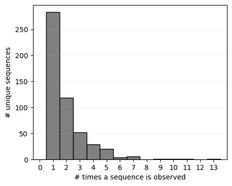
Note that about half of the possible sequences are not even observed once when sampling up to 1000 sequences, and only very few are observed more than once. While this evidences that their probability is probably lower than the highly observed sequences, there is still a wide range of variability in the sequence probability below the observable threshold that we may be able to infer by sharing information across sequence space.
How to infer the probability distribution
Lets initialize again our SeqDEFT model with P=2 and infer the sequence probability distribution underlying the finite set of observed sequences in nature
[5]:
model = SeqDEFT(P=2, seq_length=5, alphabet_type="dna")
model.fit(X=X)
100%|██████████| 115/115 [00:01<00:00, 76.80it/s]
We can see that even for a small example of 5 nucleotides long sequence spanning only \(4^5=1024\) possible genotypes, iterating through all the cross-validation folds for each \(a\) value takes a substatial amount of time. For larger genotypic spaces, however, one could paralellize these calculations by defining the training and testing datasets for the cross-validation and fit the model with different \(a\) values at the same time.
Lets see how the log-likelihood in held-out data evolves with the different values of the hyperparameter \(a\) tested.
[6]:
model.logL_df
[6]:
| a | fold | logL | log_a | sd | log_sd | |
|---|---|---|---|---|---|---|
| 0 | inf | 0 | -549.138582 | inf | 0.000000 | -inf |
| 1 | 0.000000e+00 | 0 | -inf | -inf | inf | inf |
| 2 | 2.304000e-02 | 0 | -898.833218 | -1.637518 | 1000.000000 | 3.000000 |
| 3 | 4.767294e-02 | 0 | -857.582105 | -1.321728 | 695.192796 | 2.842105 |
| 4 | 9.864190e-02 | 0 | -816.141016 | -1.005939 | 483.293024 | 2.684211 |
| ... | ... | ... | ... | ... | ... | ... |
| 110 | 2.600843e+03 | 4 | -524.461109 | 3.415114 | 2.976351 | 0.473684 |
| 111 | 5.381502e+03 | 4 | -536.966293 | 3.730904 | 2.069138 | 0.315789 |
| 112 | 1.113507e+04 | 4 | -545.819110 | 4.046693 | 1.438450 | 0.157895 |
| 113 | 2.304000e+04 | 4 | -551.033217 | 4.362482 | 1.000000 | 0.000000 |
| 114 | inf | 4 | -556.484780 | inf | 0.000000 | -inf |
115 rows × 6 columns
[7]:
print('a*={}'.format(model.a))
a*=607.4843670674737
Lets now infer the complete genotype-phenotype map under the a prior distribution defined by a
[8]:
inferred = model.predict()
inferred
[8]:
| frequency | phi | Q_star | |
|---|---|---|---|
| AAAAA | 0.000 | 7.232449 | 0.000723 |
| AAAAC | 0.001 | 7.126278 | 0.000804 |
| AAAAG | 0.000 | 7.187344 | 0.000756 |
| AAAAT | 0.001 | 7.294846 | 0.000679 |
| AAACA | 0.000 | 7.398920 | 0.000612 |
| ... | ... | ... | ... |
| TTTGT | 0.000 | 7.397642 | 0.000613 |
| TTTTA | 0.000 | 7.509691 | 0.000548 |
| TTTTC | 0.000 | 7.196643 | 0.000749 |
| TTTTG | 0.001 | 6.589644 | 0.001375 |
| TTTTT | 0.003 | 6.468792 | 0.001551 |
1024 rows × 3 columns
[9]:
fig = plot.figure_SeqDEFT_summary(model.logL_df, inferred, legend_loc=4)
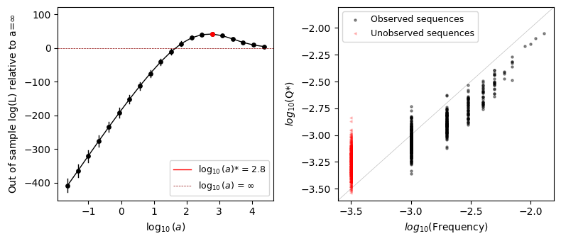
We can see that the optimal value \(a^*\) is far from 0 but also is not \(\infty\) either and close to the true generating \(a_{True}=500\), showing that the optimal solution is indeed somewhere in between the maximum entropy solution and the empirical frequencies. In this case, we chose \(a\) to have relatively small deviation from the additive model, so that the cross-validated likelihood in the case \(a=\infty\) is close to that under \(a^*\)
The second plot shows the relationship between the observed frequencies in the data and the inferred probabilities for each of the genotypes. For high frequencies, we generally see a very good agreement between the observed frequencies and inferred probabilities. However, as we start to have lower number of counts per sequence, we can see how the prior becomes more and more important. In fact, the sequences with lowest frequency, those never observed or only once, show substantial variability in the inferred densities thanks to our ability to share information across neighboring sequences and smooth the log-probabilities over sequence space.
Note that we are also plotting sequences with 0-counts in red and with a different marker at an arbitrary position in the x-axis. We can see that the inferred probabilities are in average lower than for those sequences with 1 count, but both sets of sequences show a large spread when compared to that difference. This means that, at least in this case, observing a sequence alone does not provide such a strong evidence of functionality as compared with unobserved sequences.
Evaluating the inferred probability distributions
In this case, as the data was simulated, we can see good our estimates of the sequence density were by comparing with the true data generating probabilities
[10]:
inferred['Q_true'] = np.exp(- phi - logsumexp(phi))
inferred
[10]:
| frequency | phi | Q_star | Q_true | |
|---|---|---|---|---|
| AAAAA | 0.000 | 7.232449 | 0.000723 | 0.000631 |
| AAAAC | 0.001 | 7.126278 | 0.000804 | 0.000629 |
| AAAAG | 0.000 | 7.187344 | 0.000756 | 0.000376 |
| AAAAT | 0.001 | 7.294846 | 0.000679 | 0.000999 |
| AAACA | 0.000 | 7.398920 | 0.000612 | 0.000846 |
| ... | ... | ... | ... | ... |
| TTTGT | 0.000 | 7.397642 | 0.000613 | 0.000371 |
| TTTTA | 0.000 | 7.509691 | 0.000548 | 0.000275 |
| TTTTC | 0.000 | 7.196643 | 0.000749 | 0.000815 |
| TTTTG | 0.001 | 6.589644 | 0.001375 | 0.003237 |
| TTTTT | 0.003 | 6.468792 | 0.001551 | 0.001664 |
1024 rows × 4 columns
[11]:
fig, axes = plt.subplots(1, 1, figsize=(4, 4), sharex=True, sharey=True)

Q = inferred[['Q_true', 'Q_star']].values.flatten()
lims = (Q.min()/2, Q.max()*2)
axes.scatter(inferred['Q_true'], inferred['Q_star'], s=5, c='black', alpha=0.5, lw=0)
axes.plot(lims, lims, lw=0.5, linestyle='--', c='grey')
axes.set(xlabel=r'$Q_{real}$', ylabel=r'$Q_{inferred}$',
         xscale='log', yscale='log',
         xlim=lims, ylim=lims)

r2 = pearsonr(np.log(inferred['Q_true']), np.log(inferred['Q_star']))[0] **2
axes.text(0.05, 0.95, '$R^2$={:.2f}'.format(r2), transform=axes.transAxes,
          ha='left', va='top')
[11]:
Text(0.05, 0.95, '$R^2$=0.46')
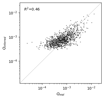
We can see that even for sequences with low density, such that they would almost never be observed in practice by sampling only 1000 genotypes from this distribution, SeqDEFT provides a moderately good estimate of the sequence density. While it tends to overestimate the density of very rare sequences, it still provides a good idea of which sequences have higher or lower probability.
Main features of the probability distribution
But maybe a more important issue rather than the precission with which we can estimate the sequence probability is whether we are able to recover the main qualitative features of the original landscape from the simulated data. Thus, we can compare the visualizations for both the real and the estimated \(\log Q\) as follows:
[12]:
space_real = SequenceSpace(X=inferred.index.values, y=np.log10(inferred['Q_true']))
space_inferred = SequenceSpace(X=inferred.index.values, y=np.log10(inferred['Q_star']))
spaces = {'real': space_real, 'inferred': space_inferred}
How to visualize a probability distribution
When trying to visualize densities rather than an arbitrary function or phenotype over sequence space, it provides a very natural way of setting the hyperparameter Ns, since we can assume that the observed densities correspond to the stationary frequencies under our evolutionary model. As we saw previously, the stationary frequencies are given by:
Thus, if we assume that \(f_i = \log Q_i\), then we can choose Ns=1 and:
This way, differences in \(\log Q\) between two genotypes correspond to the scaled selection coefficient between them \(S_{ij}\), and provides a natural scale for interpreting differences e.g. for \(S_{ij}\sim1\) evolution would be nearly neutral and those mutations would fix very frequently.
[13]:
viz = {}
for label, space in spaces.items():
    rw = WMWalk(space)
    rw.calc_visualization(Ns=1, n_components=5)
    nodes_df, edges_df = rw.nodes_df, rw.space.get_edges_df()
    viz[label] = nodes_df, edges_df
[14]:
fig, subplots = plot.init_fig(1, len(spaces), colsize=5.5, rowsize=5)

for axes, (label, (nodes_df, edges_df)) in zip(subplots, viz.items()):
    plot.plot_visualization(axes, nodes_df, edges_df=edges_df, nodes_size=10)
    axes.set_title('{} landscape'.format(label.capitalize()))

fig.tight_layout()
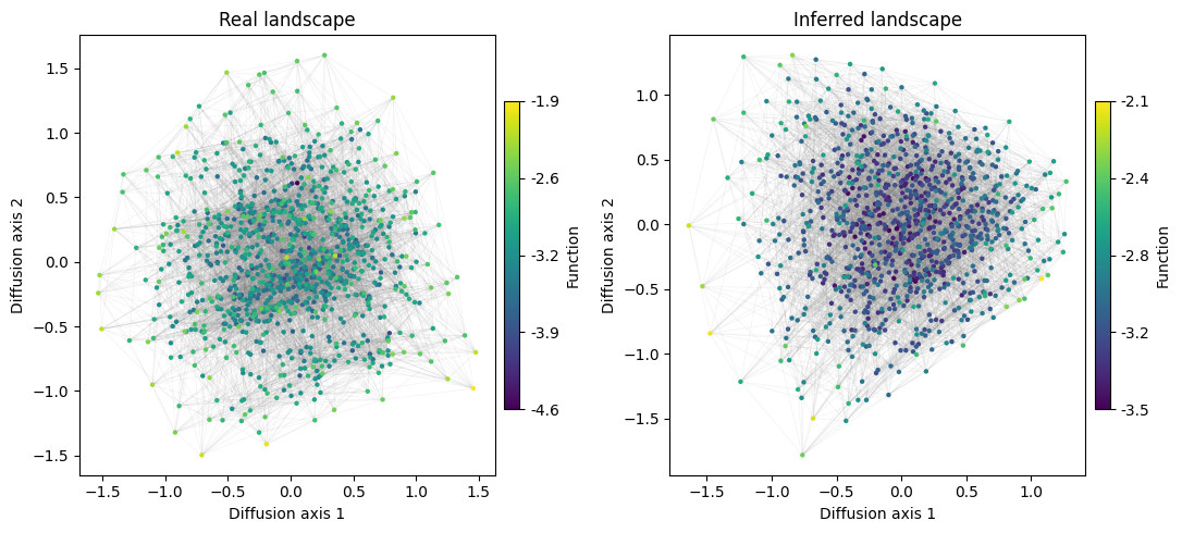
It seems that the structure of the two landscapes is similar, but it is unclear from the plots whether the most separated set of sequences are the same in the two plots. We can instead show how the coordinates in the different diffusion axis correlate across the two embeddings
[15]:
fig, subplots = plot.init_fig(3, 3, colsize=2.5, rowsize=2.5, sharex=True, sharey=True)
for i in range(3):
    for j in range(3):
        axes = subplots[i, j]
        x, y = viz['real'][0][str(i+1)].values, viz['inferred'][0][str(j+1)].values
        axes.hist2d(x=x, y=y, cmap='Blues', bins=40)
        axes.set(xlabel='', ylabel='', xticks=[], yticks=[])

        if j == 0:
            axes.set(ylabel='Diffusion axis {}'.format(i+1))
        if i == 2:
            axes.set(xlabel='Diffusion axis {}'.format(j+1))
fig.tight_layout(pad=3.5, w_pad=0.1, h_pad=0.1)
fig.supxlabel('Real landscape', x=0.52)
fig.supylabel('Inferred landscape', y=0.52)
[15]:
Text(0.02, 0.52, 'Inferred landscape')
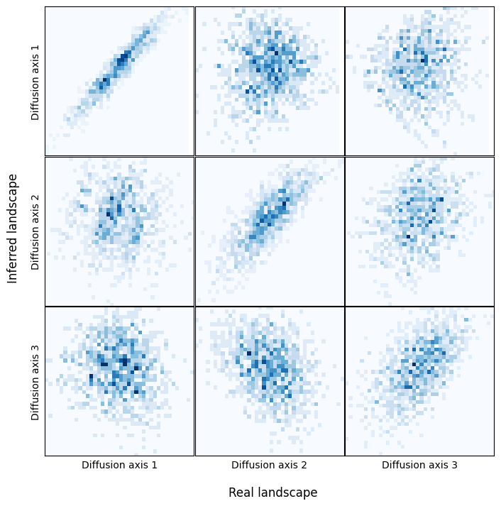
Thus, we can see that the main structure is preserved, with a very good correlation in the coordinates of the main diffusion axes between the real and inferred sequence densities.
How to calculate the uncertainty of the predictions
So far, all the previous analyses of the inferred probability distribution were done with the Maximum a posteriori (MAP) estimate. However, the Gaussian process formalism allow us to obtain the complete posterior distribution of the genotype-phenotype map. Given that SeqDEFT uses a non-gaussain likelihood function, we have no closed form analytical solution for the posterior, but we can use the Laplace approximation and assume that the posterior distribution is also Gaussian with a
covariance matrix that equals the inverse Hessian of the log-posterior. We can use the predict method with argument calc_variance=True to obtain uncertainty estimates.
[16]:
predictions = model.predict(calc_variance=True)
predictions
0%| | 0/1024 [00:00<?, ?it/s]100%|██████████| 1024/1024 [00:02<00:00, 377.85it/s]
[16]:
| f | f_var | f_std | ci_95_lower | ci_95_upper | |
|---|---|---|---|---|---|
| AAAAA | 7.232449 | 0.392891 | 0.626810 | 5.978829 | 8.486070 |
| AAAAC | 7.126278 | 0.384873 | 0.620382 | 5.885515 | 8.367042 |
| AAAAG | 7.187344 | 0.385923 | 0.621227 | 5.944890 | 8.429798 |
| AAAAT | 7.294846 | 0.408755 | 0.639339 | 6.016168 | 8.573525 |
| AAACA | 7.398920 | 0.414426 | 0.643760 | 6.111401 | 8.686440 |
| ... | ... | ... | ... | ... | ... |
| TTTGT | 7.397642 | 0.413891 | 0.643344 | 6.110954 | 8.684329 |
| TTTTA | 7.509691 | 0.426710 | 0.653230 | 6.203231 | 8.816152 |
| TTTTC | 7.196643 | 0.385889 | 0.621199 | 5.954244 | 8.439042 |
| TTTTG | 6.589644 | 0.306095 | 0.553259 | 5.483127 | 7.696161 |
| TTTTT | 6.468792 | 0.296445 | 0.544467 | 5.379857 | 7.557726 |
1024 rows × 5 columns
[17]:
predictions['phi_true'] = phi - (phi - predictions['f']).mean()
[18]:
perc = np.mean((predictions['phi_true'] > predictions['ci_95_lower']) & (predictions['phi_true'] < predictions['ci_95_upper'])) * 100
fig, axes = plt.subplots(1, 1, figsize=(5, 5))
axes.errorbar(x=-predictions['phi_true'], y=-predictions['f'], c='black', ms=3,
              yerr=2 * predictions['f_std'], marker='o', alpha=0.2, lw=0, elinewidth=1)
lim = (-11, -3)
axes.axline((-5, -5), (-6, -6), lw=0.5, c='black', linestyle='--')
axes.set(xlabel=r'$-\phi_{True}$', ylabel=r'$-\phi_{pred}$',
         ylim=lim, xlim=lim, aspect='equal')
axes.text(0.03, 0.97, 'Calibration={:.2f}%'.format(perc), transform=axes.transAxes, va='top')
axes.grid(alpha=0.2)
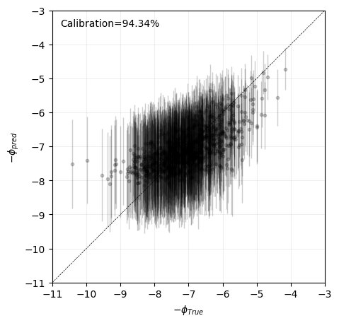
In this example, we find that the posterior distribution is relatively well approximated by a gaussian, as the Laplace approximation provides well calibrated predictions, as the true generating values lie within the 95% credible interval around 95% of the times.
Note: Computation of the variance of a single sequence requires solving a large system of equations using iterative methods. While in this small examples we can eaisly compute the posterior variance for every sequence, as the space of possible sequences grows larger, this may become infeasible and the computation of uncertainty may be limited to a reduced number of sequences specified
How to estimate mutational effects and epistatic coefficients
In many cases, rather than in the individual estimates for individual sequences, we aim to compare a reduced number of sequences e.g. to derive mutational effects and epistatic coefficients. We can obtain the posterior distribution for those comparisons by defining a contrast matrix and using the make_contrast method
For instance, if we want to estimate of the effect of an A1T mutation in a AGCGA sequence context, we define a contrast matrix with contrasts on the columns and sequences on rows as follows:
[19]:
contrast_matrix = pd.DataFrame({'A1T': [1, -1]}, index=['TGCGA', 'AGCGA'])
contrast_matrix
[19]:
| A1T | |
|---|---|
| TGCGA | 1 |
| AGCGA | -1 |
[20]:
results = model.make_contrasts(contrast_matrix)
results
0%| | 0/2 [00:00<?, ?it/s]100%|██████████| 2/2 [00:00<00:00, 326.04it/s]
[20]:
| estimate | std | ci_95_lower | ci_95_upper | p(|x|>0) | |
|---|---|---|---|---|---|
| A1T | -0.22393 | 0.888807 | -2.001543 | 1.553684 | 0.599458 |
Here, we estimate that this mutation most likely has an small effect, but there is a substantial degree of uncertainty, such that it could range from moderately deleterious to moderately beneficial. We may ask now the effect of the same mutation in a different genetic context such as ACTCG
[21]:
contrast_matrix = pd.DataFrame({'A1T': [1, -1]}, index=['TCTCG', 'ACTCG'])
results = model.make_contrasts(contrast_matrix)
results
100%|██████████| 2/2 [00:00<00:00, 179.32it/s]
[21]:
| estimate | std | ci_95_lower | ci_95_upper | p(|x|>0) | |
|---|---|---|---|---|---|
| A1T | -0.036406 | 0.787761 | -1.611928 | 1.539117 | 0.51843 |
Now we can see that this mutation is likely to have a deleterious effect in the ACTCG context. As ACTCG ranks among the most frequently observed sequences, we have more data to support its deleterious effect in this background, which is reflected in a much tighter posterior distribution.
However, as these posterior distributions may be correlated, to directly compare the effect of this mutation in the two genetic context, we should define an additional contrast
[22]:
contrast_matrix = pd.DataFrame({'A1T_in_ACTCG_vs_AGCGA': [1, -1, -1, 1]},
                                index=['TCTCG', 'ACTCG', 'TGCGA', 'AGCGA'])
results = model.make_contrasts(contrast_matrix)
results
0%| | 0/2 [00:00<?, ?it/s]100%|██████████| 2/2 [00:00<00:00, 190.14it/s]
[22]:
| estimate | std | ci_95_lower | ci_95_upper | p(|x|>0) | |
|---|---|---|---|---|---|
| A1T_in_ACTCG_vs_AGCGA | 0.187524 | 1.188433 | -2.189341 | 2.56439 | 0.562689 |
Thus, we not only estimate uncertainty of the effects of mutations in specific genetic backgrounds, but also estimate how much the effects of mutations differ across different genetic backgrounds e.g. whether A1T is more deleterious in the ACTCG context than it is in the AGCGA context.
Inference from real data: 5´splice site
In the previous sections, we have showed how to run SeqDEFT on a small simulated dataset where the true underlying probability distribution is perfectly known. Next, we will show how to run in on a larger dataset and how to reproduce the inference and visualization performed in the original publication (Chen et al. 2022) using the set of 5’splice sites extracted from the human genome.
Data preprocessing
[25]:
ss = DataSet('5ss')
ss.data
X = ss.data['X'].values
We can see that there is a large number of observations along the human genome. Previous efforts have used pairwise Maximum Entropy models to characterize the splice sites probability distributions along the genome (Yeo and Burge (2004)). In what follows, we relax the constrains of this pairwise model to allow variability in the local pairwise epistatic coefficients by specifying P=2. To reduce the computational burden and for simplicity, we
have previously selected the sequences that have the cannonical GU at positions +1 and +2 and investigate the dependencies on the other positions: -3 to -1 together with +3 to +6.
Inference with SeqDEFT
[26]:
model = SeqDEFT(P=2, seq_length=7, alphabet_type='dna')
model.fit(X=X)
100%|██████████| 115/115 [01:45<00:00, 1.09it/s]
Note that fitting the model for a dataset this large takes a long time. For illustration purposes, we can use the estimated probability distribution from the built-in dataset
[27]:
inferred = model.predict()
inferred
[27]:
| frequency | phi | Q_star | |
|---|---|---|---|
| AAAAAAA | 0.000129 | 8.971240 | 1.270082e-04 |
| AAAAAAC | 0.000058 | 9.763325 | 5.752193e-05 |
| AAAAAAG | 0.000133 | 8.936124 | 1.315475e-04 |
| AAAAAAT | 0.000272 | 8.211820 | 2.714210e-04 |
| AAAAACA | 0.000017 | 10.978710 | 1.706078e-05 |
| ... | ... | ... | ... |
| TTTTTGT | 0.000010 | 11.660838 | 8.624898e-06 |
| TTTTTTA | 0.000014 | 12.146376 | 5.307470e-06 |
| TTTTTTC | 0.000000 | 14.344344 | 5.892810e-07 |
| TTTTTTG | 0.000003 | 13.649076 | 1.181064e-06 |
| TTTTTTT | 0.000014 | 11.777528 | 7.674963e-06 |
16384 rows × 3 columns
[28]:
fig = plot.figure_SeqDEFT_summary(model.logL_df, inferred, show_folds=True, legend_loc=3)
We can see how the probability of sequences that have been observed a fair number of times matches their frequency in the dataset, but there is a large variation, of several orders of magnitude in the probability of sequences that have been observed only a few times in the dataset or none at all, as highlithed in red
Landscape visualization
[29]:
space = SequenceSpace(X=inferred.index.values, y=np.log(inferred['Q_star']))
print(space)
Sequence Space:
        Type: dna
        Sequence length: 7
        Number of alleles per site: [4, 4, 4, 4, 4, 4, 4]
        Genotypes: [AAAAAAA,AAAAAAC,AAAAAAG,...,TTTTTTC,TTTTTTG,TTTTTTT]
        Function y: [-8.97,-9.76,-8.94,...,-14.34,-13.65,-11.78]
[30]:
rw = WMWalk(space)
rw.calc_visualization(Ns=1)
ndf, edf = rw.nodes_df, space.get_edges_df()
ndf['2'] = -ndf['2']
ndf['1'] = -ndf['1']
ndf.index = np.array([seq[:3] + 'GT' + seq[3:] for seq in ndf.index])
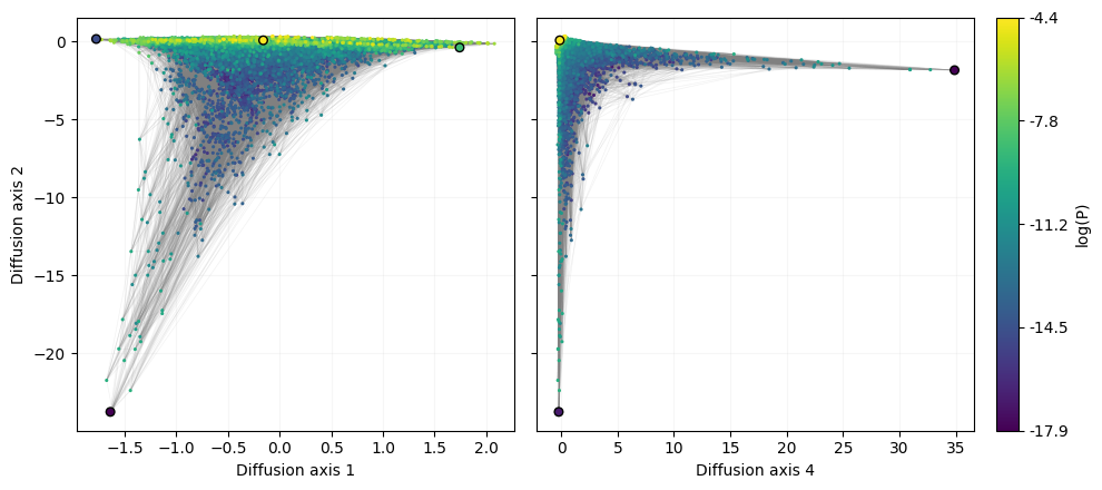
After generating the coordinates of the visualization and re-inserting the GT sequence at +1 and +2, we can plot the resulting landscape and highlight the sequences that were previously reported to characterize qualitatively different solutions to the 5’splice site recognition (Chen et al. 2022)
[31]:
fig, subplots = plt.subplots(1, 3, figsize=(10, 4.5), width_ratios=(0.5, 0.5, 0.025))
cbar_ax = subplots[-1]

axes = subplots[0]
plot.plot_visualization(axes, ndf, edges_df=edf, nodes_size=5,
                        nodes_cmap_label='log(P)', nodes_cbar_axes=cbar_ax)
seqs = ['CAGGTTCAA', 'CAGGTAAGT', 'TCTGTAAGT',
        'ACTGTATCC']
plot.plot_nodes(axes, ndf.loc[seqs, :], size=30, lw=1, edgecolor='black', cbar=False)
axes.grid(alpha=0.1)

axes = subplots[1]
plot.plot_visualization(axes, ndf, edges_df=edf, nodes_size=5, x='4',
                        nodes_cmap_label='log(P)', nodes_cbar=False)
seqs = ['CAGGTAAGT', 'ACTGTATCC',
        'ACAGTTAAG']
plot.plot_nodes(axes, ndf.loc[seqs, :], size=30, lw=1, edgecolor='black', cbar=False, x='4')
axes.set(ylabel='', yticklabels=[])
axes.grid(alpha=0.1)

fig.tight_layout()
Inference from real data: the Shine-Dalgarno sequence
In this section, we will show how to use SeqDEFT to infer and analyze the genotype-phenotype map of the Shine-Dalgarno (SD) sequence as in our original paper (Martí-Gómez et al. 2025). For full reproducibility of the analysis of the Shine-Dalgarno landscape, including processing of the raw data, see the associated repository.
Loading natural Shine-Dalgarno sequences from the E.coli genome
Here, for simplicity, we use the built-in dataset provided by gpmap-tools for the Shine-Dalgarno sequence as inferred from the collection of 5’UTR sequences in the E.coli genome.
[7]:
dataset = DataSet('shine_dalgarno')
X = dataset.data['X'].values
dataset.data
[7]:
| X | |
|---|---|
| 0 | AAAAAAGGU |
| 1 | AAAAACAUC |
| 2 | AAAAACGUA |
| 3 | AAAAAGAAU |
| 4 | AAAAAGGAA |
| ... | ... |
| 5306 | UUUUGUACU |
| 5307 | UUUUUGAGG |
| 5308 | UUUUUGCCG |
| 5309 | UUUUUUAUA |
| 5310 | UUUUUUUUU |
5311 rows × 1 columns
Estimating magnitude of local epistatic interactions
First, SeqDEFT optimizes the hyperparameter \(a\) controlling the expected magnitude of local epistatic coefficients (P=2) via cross-validation.
[ ]:
model = SeqDEFT(P=2, seq_length=9, alphabet_type='rna')
model.fit(X=X)
100%|██████████| 115/115 [18:24<00:00, 9.60s/it]
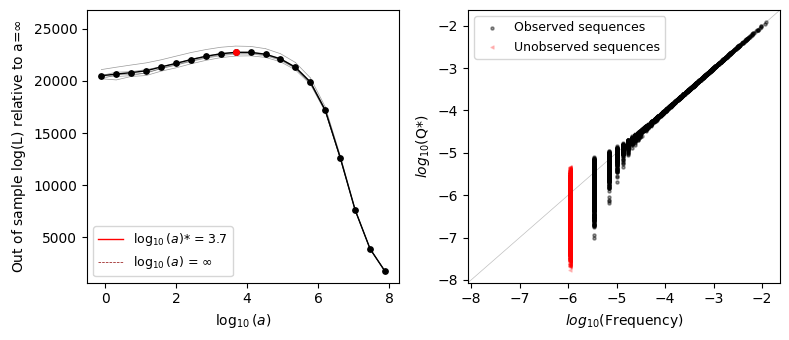
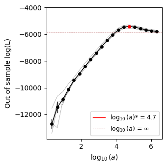
We can plot the cross-validation curve and see that the optimal \(a^*\) is reached for an intermediate value of \(a\) far from \(a=\infty\) and \(a=0\) representing the maximum entropy (site-independent) model and the maximum likelihood (empirical frequencies) model, showing strong evidence of epistatic interactions within the Shine-Dalgarno sequence in 5’UTR sequences in the E.coli genome.
[22]:
fig, axes = plt.subplots(1, 1, figsize=(3.5, 3.5))
plot.plot_hyperparam_cv(model.logL_df, axes=axes, legend_loc=4)
fig.tight_layout()
Inference of the Shine-Dalgarno fitness landscape
We then compute the posterior distribution under the prior determined by \(a^*\) as follows
[12]:
inferred = model.predict()
inferred
[12]:
| frequency | phi | Q_star | |
|---|---|---|---|
| AAAAAAAAA | 0.000000 | 11.054176 | 1.581004e-05 |
| AAAAAAAAC | 0.000000 | 11.553966 | 9.591286e-06 |
| AAAAAAAAG | 0.000000 | 11.369387 | 1.153556e-05 |
| AAAAAAAAU | 0.000000 | 11.113964 | 1.489249e-05 |
| AAAAAAACA | 0.000000 | 11.819003 | 7.358217e-06 |
| ... | ... | ... | ... |
| UUUUUUUGU | 0.000000 | 14.841402 | 3.582296e-07 |
| UUUUUUUUA | 0.000000 | 14.343706 | 5.892618e-07 |
| UUUUUUUUC | 0.000000 | 15.061614 | 2.874251e-07 |
| UUUUUUUUG | 0.000000 | 14.950501 | 3.212037e-07 |
| UUUUUUUUU | 0.000188 | 13.231661 | 1.791691e-06 |
262144 rows × 3 columns
which can be compared to the empirical frequencies
[23]:
fig, axes = plt.subplots(1, 1, figsize=(3.5, 3.5))
plot.plot_density_vs_frequency(inferred, axes=axes)
fig.tight_layout()
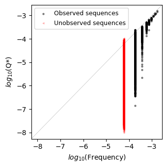
We can see how the probability of sequences that have been observed a fair number of times matches their frequency in the dataset, but there is a large variation, of several orders of magnitude in the estimated probability of sequences that have been observed only a few times in the dataset or none at all, as highlithed in red.
Estimating context-dependent mutational effects
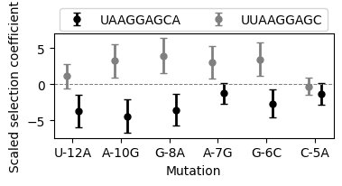
As with VCregression, gpmap-tools also enables the computation of the posterior distribution of any possible linear combination of phenotypes given a SeqDEFT model by using the Laplace approximation. This can be used, for instance, to compute the posterior distribution for the effects of a series of mutations in different genetic backgrounds. In this case, we want to test the effects of mutations in two genetic backgrounds 'UUAAGGAGC' and 'UAAGGAGCA', characterized by having
an AGGAG motif at adjacent positions in the sequence.
To do this, as in any linear model, we need to define a contrast matrix, with a series of sequences on the rows and the specified contrasts on the columns.
[26]:
backgrounds = ["UUAAGGAGC", "UAAGGAGCA"]
positions = np.arange(-13, -4)
contrasts = {}
for bc1, bc2 in combinations(backgrounds, 2):
    for p, (pos, a1, a2) in enumerate(zip(positions, bc1, bc2)):
        if a1 == a2:
            continue
        label = "{}{}{}".format(a1, pos, a2)

        for bc in [bc1, bc2]:
            s = [c for c in bc]
            s[p] = a1
            s1 = "".join(s)
            s[p] = a2
            s2 = "".join(s)
            contrasts["{}_in_{}".format(label, bc)] = {s1: -1, s2: 1}
contrasts_matrix = pd.DataFrame(contrasts).fillna(0)
contrasts_matrix
[26]:
| U-12A_in_UUAAGGAGC | U-12A_in_UAAGGAGCA | A-10G_in_UUAAGGAGC | A-10G_in_UAAGGAGCA | G-8A_in_UUAAGGAGC | G-8A_in_UAAGGAGCA | A-7G_in_UUAAGGAGC | A-7G_in_UAAGGAGCA | G-6C_in_UUAAGGAGC | G-6C_in_UAAGGAGCA | C-5A_in_UUAAGGAGC | C-5A_in_UAAGGAGCA | |
|---|---|---|---|---|---|---|---|---|---|---|---|---|
| UUAAGGAGC | -1.0 | 0.0 | -1.0 | 0.0 | -1.0 | 0.0 | -1.0 | 0.0 | -1.0 | 0.0 | -1.0 | 0.0 |
| UAAAGGAGC | 1.0 | 0.0 | 0.0 | 0.0 | 0.0 | 0.0 | 0.0 | 0.0 | 0.0 | 0.0 | 0.0 | 0.0 |
| UUAGGAGCA | 0.0 | -1.0 | 0.0 | 0.0 | 0.0 | 0.0 | 0.0 | 0.0 | 0.0 | 0.0 | 0.0 | 0.0 |
| UAAGGAGCA | 0.0 | 1.0 | 0.0 | 1.0 | 0.0 | 1.0 | 0.0 | 1.0 | 0.0 | 1.0 | 0.0 | 1.0 |
| UUAGGGAGC | 0.0 | 0.0 | 1.0 | 0.0 | 0.0 | 0.0 | 0.0 | 0.0 | 0.0 | 0.0 | 0.0 | 0.0 |
| UAAAGAGCA | 0.0 | 0.0 | 0.0 | -1.0 | 0.0 | 0.0 | 0.0 | 0.0 | 0.0 | 0.0 | 0.0 | 0.0 |
| UUAAGAAGC | 0.0 | 0.0 | 0.0 | 0.0 | 1.0 | 0.0 | 0.0 | 0.0 | 0.0 | 0.0 | 0.0 | 0.0 |
| UAAGGGGCA | 0.0 | 0.0 | 0.0 | 0.0 | 0.0 | -1.0 | 0.0 | 0.0 | 0.0 | 0.0 | 0.0 | 0.0 |
| UUAAGGGGC | 0.0 | 0.0 | 0.0 | 0.0 | 0.0 | 0.0 | 1.0 | 0.0 | 0.0 | 0.0 | 0.0 | 0.0 |
| UAAGGAACA | 0.0 | 0.0 | 0.0 | 0.0 | 0.0 | 0.0 | 0.0 | -1.0 | 0.0 | 0.0 | 0.0 | 0.0 |
| UUAAGGACC | 0.0 | 0.0 | 0.0 | 0.0 | 0.0 | 0.0 | 0.0 | 0.0 | 1.0 | 0.0 | 0.0 | 0.0 |
| UAAGGAGGA | 0.0 | 0.0 | 0.0 | 0.0 | 0.0 | 0.0 | 0.0 | 0.0 | 0.0 | -1.0 | 0.0 | 0.0 |
| UUAAGGAGA | 0.0 | 0.0 | 0.0 | 0.0 | 0.0 | 0.0 | 0.0 | 0.0 | 0.0 | 0.0 | 1.0 | 0.0 |
| UAAGGAGCC | 0.0 | 0.0 | 0.0 | 0.0 | 0.0 | 0.0 | 0.0 | 0.0 | 0.0 | 0.0 | 0.0 | -1.0 |
[27]:
mut_eff_contrasts = model.make_contrasts(contrasts_matrix)
100%|██████████| 12/12 [02:42<00:00, 13.55s/it]
[28]:
items = [x.split("_") for x in mut_eff_contrasts.index.values]
mut_eff_contrasts["mutation"] = [x[0] for x in items]
mut_eff_contrasts["background"] = [x[-1] for x in items]
mut_eff_contrasts
[28]:
| estimate | std | ci_95_lower | ci_95_upper | p(|x|>0) | mutation | background | |
|---|---|---|---|---|---|---|---|
| U-12A_in_UUAAGGAGC | 1.115378 | 0.833841 | -0.552304 | 2.783061 | 0.909493 | U-12A | UUAAGGAGC |
| U-12A_in_UAAGGAGCA | -3.679166 | 1.115100 | -5.909365 | -1.448967 | 0.999516 | U-12A | UAAGGAGCA |
| A-10G_in_UUAAGGAGC | 3.244222 | 1.152507 | 0.939209 | 5.549236 | 0.997561 | A-10G | UUAAGGAGC |
| A-10G_in_UAAGGAGCA | -4.425805 | 1.176543 | -6.778891 | -2.072720 | 0.999916 | A-10G | UAAGGAGCA |
| G-8A_in_UUAAGGAGC | 3.941253 | 1.206429 | 1.528395 | 6.354110 | 0.999456 | G-8A | UUAAGGAGC |
| G-8A_in_UAAGGAGCA | -3.568519 | 1.101457 | -5.771433 | -1.365605 | 0.999402 | G-8A | UAAGGAGCA |
| A-7G_in_UUAAGGAGC | 3.015314 | 1.129226 | 0.756862 | 5.273765 | 0.996210 | A-7G | UUAAGGAGC |
| A-7G_in_UAAGGAGCA | -1.265502 | 0.717149 | -2.699800 | 0.168797 | 0.961187 | A-7G | UAAGGAGCA |
| G-6C_in_UUAAGGAGC | 3.448974 | 1.171154 | 1.106667 | 5.791282 | 0.998385 | G-6C | UUAAGGAGC |
| G-6C_in_UAAGGAGCA | -2.689106 | 0.977329 | -4.643763 | -0.734449 | 0.997034 | G-6C | UAAGGAGCA |
| C-5A_in_UUAAGGAGC | -0.291846 | 0.614327 | -1.520499 | 0.936807 | 0.682630 | C-5A | UUAAGGAGC |
| C-5A_in_UAAGGAGCA | -1.327365 | 0.729685 | -2.786735 | 0.132004 | 0.965551 | C-5A | UAAGGAGCA |
while we can already see the differences in the effects of mutations across the two genetic backgrounds in the table, we can also plot these posterior distributions
[29]:
fig, axes = plt.subplots(1, 1, figsize=(4, 1.5))

palette = dict(zip(backgrounds, ['grey', 'black']))
dx = dict(zip(backgrounds, [-0.125, 0.125]))
kwargs = {
    "fmt": "o",
    "lw": 0,
    "elinewidth": 2,
    "capsize": 3,
    "markersize": 5,
}

for background, df in mut_eff_contrasts.groupby('background'):
    df["x"] = np.arange(df.shape[0]) - 0.125
    axes.errorbar(
        df["x"] + dx[background],
        df["estimate"],
        yerr=2 * df["std"],
        color=palette[background],
        label=background,
        **kwargs,
    )
axes.set(
    xlabel="Mutation",
    ylabel="Scaled selection coefficient",
    xticks=df["x"],
    xticklabels=df["mutation"],
)
axes.axhline(0, linestyle="--", c="grey", lw=0.75)
axes.legend(loc=(0.02, 1.025), ncol=2)
[29]:
<matplotlib.legend.Legend at 0x7f898efdc400>
Estimating average phenotype across genetic backgrounds
In some cases, when measurements are not accurate enough, it is hard to draw solid conclusions about the phenotypes or mutational effects at specific sequences. However, we can often reliably estimate the average across a series of genetic backgrounds that we believe behave in the same manner. For instance, in the SD sequence, we hypothesized that we can obtain functional sequences by having at least one of two overlapping AGGAG motifs but that only a partial AGG match would be insufficient to drive high translationa efficiency.
To investigate this question, we define a contrast matrix to compute these average phenotypes across uniformly sampled genetic backgrounds, and compare it with the wild-type sequence 'AAGGAGGUG' and the average of all possible sequences 'NNNNNNNNN'.
[64]:
bc1 = np.array(["".join(x) for x in product("ACGU", repeat=3)])
bc2 = np.array(["".join(x) for x in product("ACGU", repeat=6)])
bc3 = np.array(["".join(x) for x in product("ACGU", repeat=9)])
bc4 = np.array(["".join(x) for x in product("ACGU", repeat=2)])
p1, p2, p3 = 1.0 / bc1.shape[0], 1.0 / bc2.shape[0], 1.0 / bc3.shape[0]
p4 = 1.0 / bc4.shape[0]
contrasts = {
    "NNNNNNNNN": {x: p3 for x in bc3},
    "AGGAGGNNN": {"AGGAGG{}".format(x): p1 for x in bc1},
    "NGGAGGAGN": {"{}GGAGGAG{}".format(x[0], x[-1]): p4 for x in bc4},
    "NNNAGGNNN": {"{}AGG{}".format(x[:3], x[3:]): p2 for x in bc2},
    "NNNAGGAGG": {"{}AGGAGG".format(x): p1 for x in bc1},
}
Note: To have a reference of what the average fitness of a function sequence is, we compute the average fitness of all the sequences that were observed in nature, this is, across the 5’UTR sequences of all genes in the E.coli genome
[65]:
seqs, counts = np.unique(X, return_counts=True)
contrasts['wild-type'] = {x: c / X.shape[0] for x, c in zip(seqs, counts)}
contrast_matrix = pd.DataFrame(contrasts).fillna(0)
Note: We compute the posterior over \(\phi\), the scale of which is not meaningful in absolute terms. It is often useful to express it relative to a reference sequence. However, our estimates of any given sequence using SeqDEFT are relatively noisy, inflating the apparent uncertainty of every other phenotype. Thus, we typically compute the posterior distribution of the scaled selection coefficient relative to the average across all possible sequences
[66]:
for c in contrast_matrix.columns[1:]:
    contrast_matrix[c] = contrast_matrix['NNNNNNNNN'] - contrast_matrix[c]
contrast_matrix
[66]:
| NNNNNNNNN | AGGAGGNNN | NGGAGGAGN | NNNAGGNNN | NNNAGGAGG | wild-type | |
|---|---|---|---|---|---|---|
| AAAAAAAAA | 0.000004 | 0.000004 | 0.000004 | 0.000004 | 0.000004 | 0.000004 |
| AAAAAAAAC | 0.000004 | 0.000004 | 0.000004 | 0.000004 | 0.000004 | 0.000004 |
| AAAAAAAAG | 0.000004 | 0.000004 | 0.000004 | 0.000004 | 0.000004 | 0.000004 |
| AAAAAAAAU | 0.000004 | 0.000004 | 0.000004 | 0.000004 | 0.000004 | 0.000004 |
| AAAAAAACA | 0.000004 | 0.000004 | 0.000004 | 0.000004 | 0.000004 | 0.000004 |
| ... | ... | ... | ... | ... | ... | ... |
| UUUUUUUGU | 0.000004 | 0.000004 | 0.000004 | 0.000004 | 0.000004 | 0.000004 |
| UUUUUUUUA | 0.000004 | 0.000004 | 0.000004 | 0.000004 | 0.000004 | 0.000004 |
| UUUUUUUUC | 0.000004 | 0.000004 | 0.000004 | 0.000004 | 0.000004 | 0.000004 |
| UUUUUUUUG | 0.000004 | 0.000004 | 0.000004 | 0.000004 | 0.000004 | 0.000004 |
| UUUUUUUUU | 0.000004 | 0.000004 | 0.000004 | 0.000004 | 0.000004 | -0.000184 |
262144 rows × 6 columns
Now we compute the posterior for the specified contrasts
[67]:
avg_phenotypes_contrasts = model.make_contrasts(contrast_matrix.iloc[:, 1:])
100%|██████████| 5/5 [01:10<00:00, 14.11s/it]
[68]:
avg_phenotypes_contrasts
[68]:
| estimate | std | ci_95_lower | ci_95_upper | p(|x|>0) | |
|---|---|---|---|---|---|
| AGGAGGNNN | 3.814170 | 0.164141 | 3.485888 | 4.142452 | 1.0 |
| NGGAGGAGN | 3.977816 | 0.284874 | 3.408067 | 4.547565 | 1.0 |
| NNNAGGNNN | 2.245866 | 0.054224 | 2.137419 | 2.354313 | 1.0 |
| NNNAGGAGG | 3.881142 | 0.161634 | 3.557873 | 4.204410 | 1.0 |
| wild-type | 3.648621 | 0.028011 | 3.592598 | 3.704643 | 1.0 |
[77]:
fig, axes = plt.subplots(1, 1, figsize=(2.25, 3.5))

seqs = ["AGGAGGNNN", "NGGAGGAGN", "NNNAGGNNN", "NNNAGGAGG"]
labels = [
    r"$\bf{AGGAGG}$NNN",
    r"N$\bf{GGAGGAG}$N",
    r"NNN$\bf{AGG}$NNN",
    r"NNN$\bf{AGGAGG}$",
]
df = avg_phenotypes_contrasts.loc[seqs, :].copy()
df["step"] = np.arange(1, df.shape[0] + 1)
kwargs = {
    "fmt": "o",
    "lw": 0,
    "elinewidth": 2,
    "capsize": 3,
    "markersize": 5,
}
axes.errorbar(
    df["step"],
    df["estimate"],
    yerr=2 * df["std"],
    color='black',
    **kwargs,
)

axes.set(
    xlabel="Genetic background",
    ylabel="Scaled selection coefficient",
    xticks=df["step"],
    xlim=(0.5, 4.5),
)
axes.set_xticklabels(labels, rotation=45, ha="right")


axes.axhline(
    0,
    linestyle="--",
    c="grey",
    lw=0.75,
)
for s in ['wild-type']:
    axes.axhline(
        avg_phenotypes_contrasts.loc[s, "estimate"],
        linestyle="--",
        c="grey",
        lw=0.75,
    )
    axes.axhspan(
        ymin=avg_phenotypes_contrasts.loc[s, "ci_95_lower"],
        ymax=avg_phenotypes_contrasts.loc[s, "ci_95_upper"],
        color="grey",
        alpha=0.3,
        lw=0,
    )
fig.tight_layout()
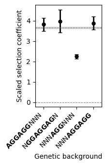
Here, we see that by averaging across genetic backgrounds, our uncertaintly about average phenotypes is relatively small, as shown by the posterior standard deviation. Moreover, these results clearly show that having an AGG triplet, is in general insufficient for obtaining sequences as fit as the average across the 5’UTR sequences in the E.coli genome. In contrast, sequences with at least one of the binding sites are estimated to be as fit as the observed wild-type sequences in average.